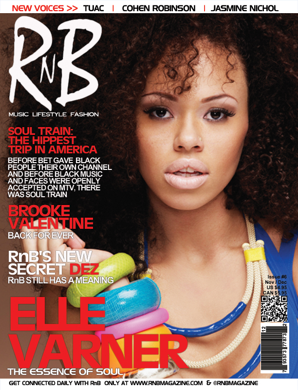
In this post I will be analyzing the front covers, contents pages, and double page spreads of two music magazines. The second magazine I will be focusing on is 'VIBE'(the first analysis can be found on a separate post).
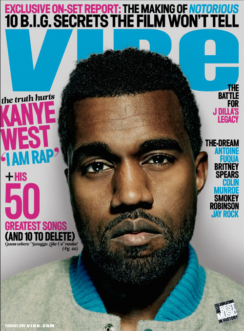
On this issue of vibe there is a consistent colour scheme which consists of pink/red and blue and some if not all of these colours can be found on the contents page and double page spread listed below.
The 'VIBE' masthead is very large, bold and stands out a lot catching the readers attention. The inside of the magazine does not really continue in this way as most of the pictures and themes are black and white.
The cover artist 'Kanye West' is photographed using a medium close up allowing us to expression and detail on his face but also to get a glimpse of clothing and styling.
The masthead is large but is placed behind the cover star which goes against the usual conventions of a magazine cover. However, this is considered acceptable in this case as the magazine is already established and already has consistent consumers who are familiar with it.
In my music magazine, I will not be placing my masthead behind as people may get confused and it may become unclear as to what the title of the magazine actually is.
The cover lines are conventionally placed on the sides/corners of the magazine and on this cover they are placed in a neat and orderly fashion with few words covering the main image.
In this issue, the contents page consists of a large mid shot image of the rapper Kanye West. Even though he is placed more to the left than in the centre of the page, the image still appears to take up the majority of the space.
The image of Kanye has been printed in black and white/grey scale making the page look quite mysterious and different from the majority of contents pages which usually have many bold colours and numbers.
However, there is one bold colour which is the heart located on the right hand side of him. Holding this heart is a female however, the readers are unable to see her face. This adds to the mysteriousness of the contents page and is a technique to gain readers curiosity and interest.
The text in the right colour is black some words printed in bold letters. The font is quite small and not very eye catching as it is unable to read from a far distance. This again highlights the mature target audience that this magazine caters for.
The expression on the feature Kanye's face highlights him as being a very serious character as his expression is quite bland and shows no emotion. This could be a representation of Kanye's musical work ethic.
When compared with the contents pages of many other magazines, it is clear to see that 'VIBE' does not really follow the conventions of a typical magazine which are usually very bold and eye catching fonts, images and headlines and large numbers in order to help the readers find the pages they are looking for quickly effectively. Contents pages are also usually loaded with smaller images to entice potential buyers into wanting to read the magazine but this one only has the one main image.
However, I believe that this was purposely in order for the magazine to gain a sense of individuality rather than sticking to the 'rules' like many magazines do.
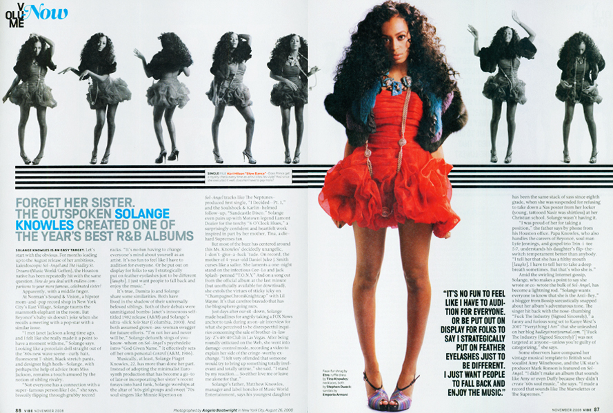
This double Page spread from Vibe magazine features Solange Knowles.
The main image has been place on the right hand side of the spread and her dress is a bold red which is very eye catching. The smaller pictures behind the main image are in black and white, drawing the readers focus on the larger image rather than anything else on the page. The fact that the background is plain and light also helps to highlight the main image.
The main image is not placed on the line where the magazine folds but on a fresh page with plenty of room as there is less writing since there is a long shot of Solange already.
On this double page spread, the layout is very simple and the use of very few colours are applied which are red and blue - a continuation from the front cover and contents page.
In all the pages of the magazine the colours are neutral with one or maybe two bold colours
The fact that there is quite a large amount of writing suggests that this magazine is targeted at a more mature audience who do not need to be entertained as much by pictures e.g. teen magazines which are usually bursting with bold electric colours.
There is also a pull quote which has been used to catch the eye of the reader as it is in bold, stand out letters making the audience curious as to what the interview may be about.


.JPG)
.JPG)
.JPG)


.png)
.png)


