The R&B genre of music is targeted at young adults between the ages of 16 - 25 however, some people from the older generations are still fond of the sound as it is what a lot of them grew up listening to when they where younger.
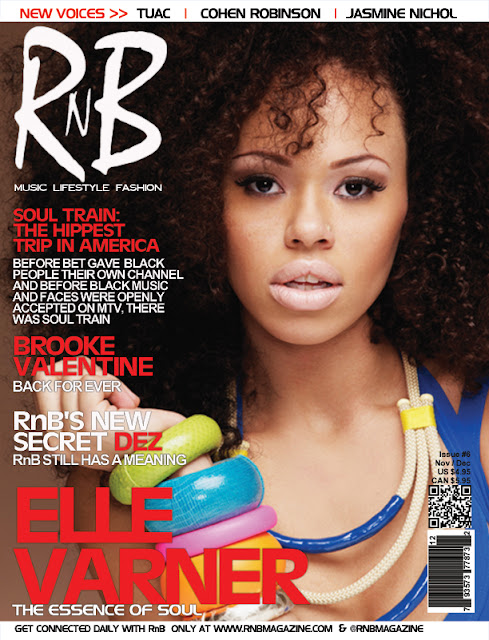
I asked a few people to tell me what they wanted to see in an R&B based magazine, what they liked, disliked and would possibly change on the front covers listed below and why. My findings are listed below.
Person 1: "In an R&B music magazine I would like to find out more about the artists life behind the music as well as the latest shows, giggs, album releases and tour dates. I find that this helps me get to know the artists as real people rather than these 'always-perfect' looking celebrities seen day to day headlining news papers and on our TV screens".
Person 2: "I would like to see lots of information on the artists and long detailed interviews with lots of good quality pictures".
(From this I have decided to try and put at least one cover line on the front of my magazine concerning my chosen artists personal life to draw the readers in and make them want to find out more)
Person 1: "I really like the front cover of this magazine as the genre is clearly stated in large fonts on the left hand corner which automatically lets me know what I will be getting. I like the fact that the cover stories are not all over the artists face and are carefully organised to one side. Also, I'm a really big fan of the cover artist which would automatically push me in the direction of buying the magazine in order to find out more about her".
Person 2: "I like the shot (extreme close up) as this is difficult to pull off without being invasive and shows the quality of the magazine".
(From this I have learnt that potential buyers like to know exactly what they are getting so making it clear what genre of music the magazine will consist of is very important. Also, I will try and have a clear structure to my magazine and ensure that text is big, bold, eye-catching and does not spread all over the cover artists face and ensure the cover shot is clear and of good quality)
Person 1: "What I dislike about the magazine is that the cover stories are not very interesting or appealing to me mainly due to the fact that there are no cover pictures to go with it making it quite bland and not as appealing as it could be. This not good as if the cover artist was someone I was not familiar with, since there are no other pictures on the cover of the magazine I would not be making a purchase".
Person 2: "I think the white font is too small and the quantity of text is too large which is quite off putting".
(From this I have learnt to make sure that I include smaller images on my front cover as well as the main image of the cover artists as readers like to get a glimpse of the other artists that will be featuring in the magazine. Also I will ensure that the cover stories are short and snappy with a good size font making it easy to read)
Person 1: "I really like the colour scheme of the magazine and the layout keeps the cover artist central but at the same time discloses a lot of information without overshadowing her".
Person 2: "The medium shot allows us to see the artists clothing as well as her face which is appealing to me as I like to see the latest fashion trends popular artists are wearing. Also, the cover lines are very interesting and make me want to read whats inside".
(From this I have learnt that readers of this genre like to see a colour scheme that fits well together and not just random colours that don't blend nicely. I will also try and include some good styling as some readers are also interested in clothing and fashion as well as the music itself)
Person 1: "I don't like the fact that there are no visuals which reveal what the inside of the magazine could be like e.g. pictures of other features and stories".
Person 2: "I would prefer it if there were smaller images on the front cover as I am not the biggest fan of Janet Jackson so having other artists on the front cover could potentially persuade me to buy".
(Again, I have learnt that readers like to see smaller images as well as the main image to get a glimpse of what else could be inside. I will try and do this by ensuring that my magazine has more than just the cover artist).


No comments:
Post a Comment