When looking back at my
preliminary task, I feel that I have learnt in detail the codes and conventions
of a typical R&B magazine which I believe to have demonstrated in my final
product. The paragraphs and pictures below will look in detail at my
progression from the prelim task to the final product...

Above are the two mastheads
that I created when making my music magazine and my educational magazine for
the preliminary task. Although the words on the first masthead are large, easy
to read and directly in the center when comparing this to the masthead of my
music magazine it is clear to see a major improvement and advancement as a
whole. I believe that this improvement is demonstrated through the mastheads unique
style of having two different colours (red and white) and a black rectangle
that the words ‘Sound Proof’ are placed on top of. By doing this, I enabled the
masthead to stand out much more than the masthead of the educational magazine
as the use of black and the other two colours help it to dominate the page and
draw potential buyers directly to it, whereas the preliminary masthead is not
as bold and eye-catching since it is just a black outline with no colour fill making
it less effective.


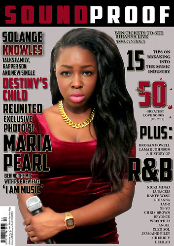
Although there is quite a difference between the two photos used on the front covers of the magazines, it is clear to see that they both suit the theme that each of the magazines hold. An example of this is in the preliminary task. We see a young student who appears happy and friendly holding books looking directly at the camera. The student holding books represents school life and therefore fits in with the ‘educational’ theme and the fact that the model is looking directly at the camera helps to form a connection with potential buyers. The same goes with the cover artist of my music magazine. Her facial expression helps portray a typical R&B magazine as artists of this genre usually appear to be quite arrogant which I think connotes confidence, independence and success. The microphone in the artists hand also helps make obvious to potential buyers that it is a music related magazine and again the use of direct eye contact helps to create a connection with potential buyers.
Although the pictures
used on both magazines fit in well with the magazines theme, the music magazine
cover photo actually took a lot more time, effort and planning as I had done
much more research into the typical codes and conventions expected in an
R&B magazine whereas in the educational magazine photograph, even though
the picture turned out quite well it was done in around 5-10 minutes with no
direction, little planning and a vague idea as to how the pictures where going
to turn out. I was even able to adjust the light settings to my music magazine
cover photo in order to get the R&B feel I was going for as by this point I
had learnt how to edit using Photoshop but could not do much editing on the
preliminary photograph since I was unfamiliar with the software.
The positioning of the cover artist in the music magazine
also looks much more professional as the model is placed directly in the center allowing it to stand out more than everything else surrounding it. This
therefore enables the cover artist to be the main attraction/focus when a
potential buyer picks it up as it dominates the page whereas the picture on the
prelim task is placed aimlessly on the left hand side of the page which does
not help it to stand out, attract reader’s attention or cause it to be the main
focus point making it very ineffective.


When looking at the two layouts of the contents pages, it is clear to see that they are both vastly different. The preliminary task does not have any form of structure and the layout is all over the place. The numbers are allocated randomly across the page and the page numbers only range from 4-18 which is extremely unrealistic for a real life magazine. The images look very ‘forced’ and unnatural which do not help form a connection with the target audience. As a whole, the page looks extremely empty seeing as there are only five cover stories mentioned and two photographs to represent the whole content of the entire magazine. The font is very plain and does not appear to be very magazine like as it looks like an essay font rather than a sophisticated, bold and edgy font which is ideal for magazines such as these, in which will help appeal to its target audience. The last cover story (number 18) isn’t even the same font as the rest of the text; this makes the page look even more unprofessional since there are careless mistakes present.
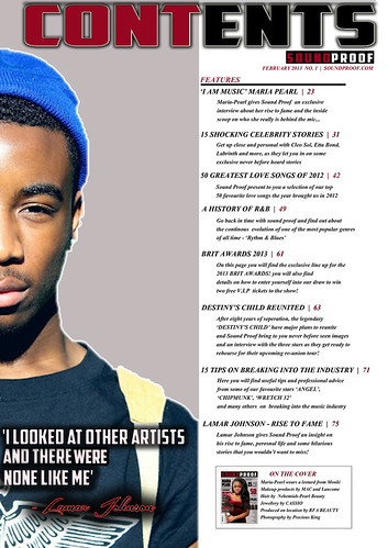
When comparing the preliminary task to the main
task, it is clear to see a vast improvement. The image used on the contents
page of the music magazine is much clearer and more eye-catching than the two
tiny images used on the prelim task. This is because it is much larger and much
closer, helping to address and form a connection with audience. The picture
does not look at all forced but natural and appropriate for the magazine’s
musical theme. It is obvious that the structure of this contents page was
planned in much more detail and thought out extensively as everything looks precise
and well aligned with each other. I believe that this large improvement is due
to much research and planning into the codes and conventions of R&B music
magazines (which can be found on my blog). In doing this I was really able to develop
these conventions and make them my own which ultimately allowed me to form the
magazines unique features and style. The layout of the main task contents page has
the text separated on one half of the page rather than having it too
intertwined. Doing this doesn’t just make it much clearer and easier to read
but it also makes it look very professional, organised, well structured and
thought out.
When evaluating the fonts used on the front cover and contents page of the preliminary task, it is clear to see a lack of knowledge concerning the codes and conventions of an R&B music magazine. I used a small essay type font rather than a big bold font that stands out which would enable potential buyers to easily read the text increasing the chances of catching their attention. The font again is quite soft and sort of fades into the rest of the front cover causing it to be very ineffective. When looking at the font on the front cover of my music magazine, the improvement is obvious. This is because I have used large bold fonts mainly in capital letters, adding drop shadows and outlines to really make the text jump out to its target audience. Having the font like this conforms to the codes and conventions of a typical music magazine but also brings style and professionalism to it.
The
font on the contents page of my music magazine is small yet stylish and
readable and also fits in well with the layout of the page. The colour scheme
has been well thought out and I even ensured that my cover artist wore red to match
it, whereas there is no real colour scheme in the preliminary task as I just
used a plain black font throughout.